Rebellious Rebrand
Client: Rebellious PR & Consulting
Industry: Public Relations, Marketing
Deliverables: Logo, color system, type system, copy, website, pitch decks, branded internal docs & more.
Team mates & friends:
Design Kai Alegre
Copy Support John James, Ashley Dingle
Industry: Public Relations, Marketing
Deliverables: Logo, color system, type system, copy, website, pitch decks, branded internal docs & more.
Team mates & friends:
Design Kai Alegre
Copy Support John James, Ashley Dingle
Rebellious is a female founded, owned, and led full service public relations agency based out of Portland and Los Angeles.
Their focus is on working with other small business owners and founders who are industry disruptors.
Their focus is on working with other small business owners and founders who are industry disruptors.


The project was started with conversations around the core values that are built the foundation of the company, who Rebellious would like to continue to attract as clients, and what services they would like to showcase.
It was important for the brand to embrace the unique qualities of the company founders and clients, and to reinforce to their clients that Rebellious is stable and strong in an unpredictable time for many business owners.
![]()
It was important for the brand to embrace the unique qualities of the company founders and clients, and to reinforce to their clients that Rebellious is stable and strong in an unpredictable time for many business owners.

The challenge was to stay outside, and stay unique to the public relations industry, while looking recognizable as a professional service to current and potential clients.
With the target audience being Gen Xers and Older Millennial business owners who are industry disruptors in their services, products, and approach towards business.
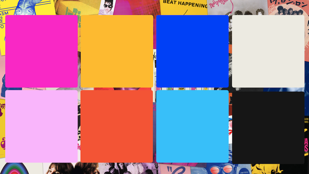
The color palette takes tones found on the patinated vinyl records that shaped the founders and the clients uniqueness and identity.
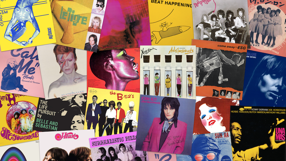
Selected colors:
With the new growth of the company moving towards providing different services beyond public relations to their clients, the new service illustrations show the varied abundance of the offerings to clients using abstraction to push the viewer’s imagination.
While holding true to the inspiration from music iconography, using collaged duo-toned compilations.![]()
While holding true to the inspiration from music iconography, using collaged duo-toned compilations.

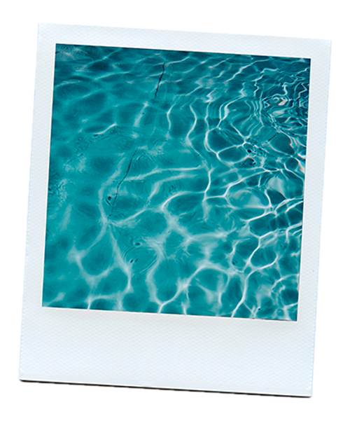
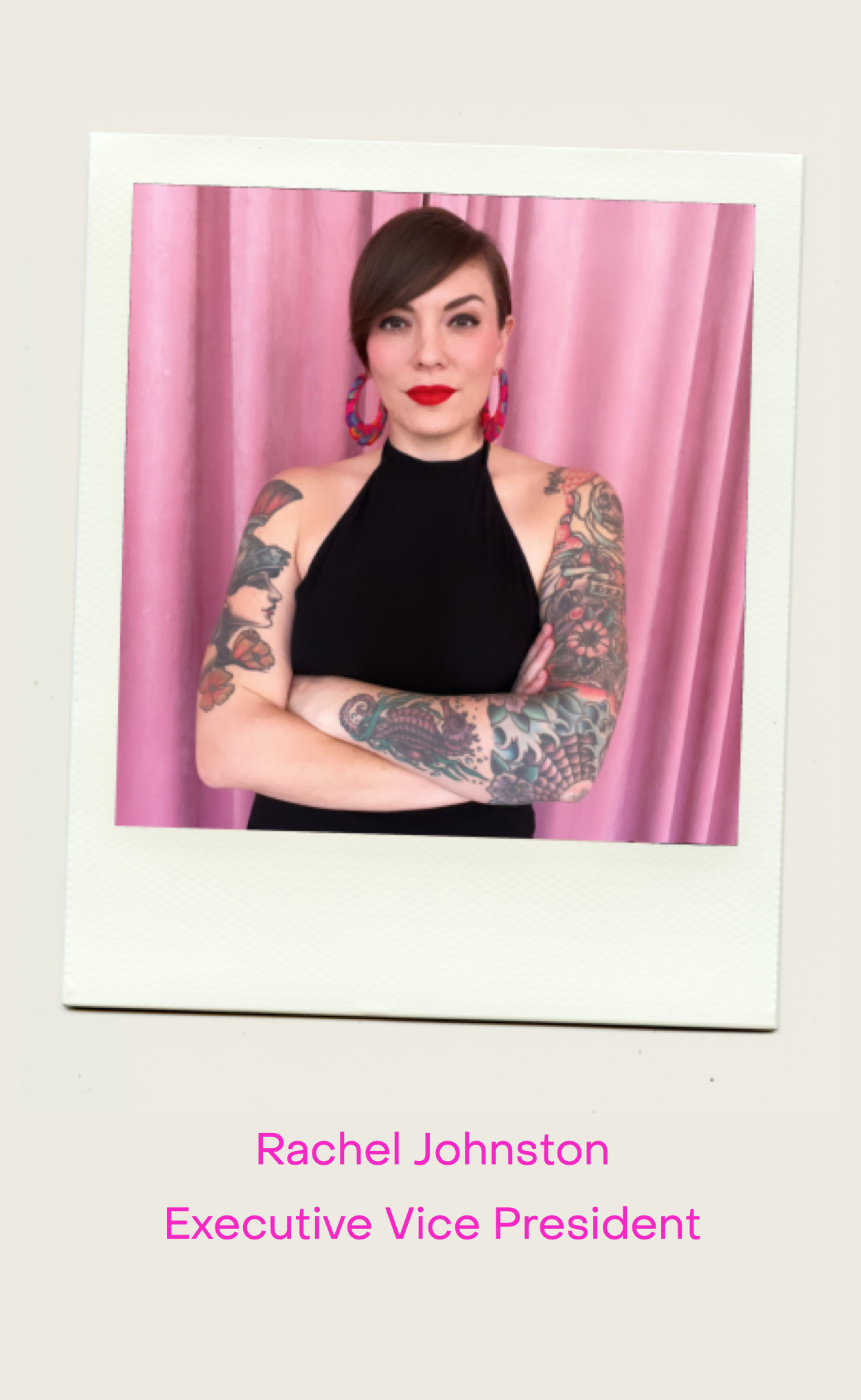
Polaroids. Instant gratification. Instant fun. Instant nostalgia.
Brings to mind that Rebellious loves to do things with care, fun, and cherished memories – and a little bit differently.
The Rebellious polaroids capture the locations of the team, as well as the team members themselves.
![]()
![]()
![]()
Brings to mind that Rebellious loves to do things with care, fun, and cherished memories – and a little bit differently.
The Rebellious polaroids capture the locations of the team, as well as the team members themselves.

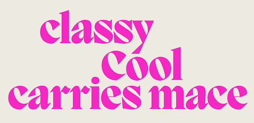
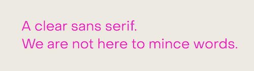
The type system was a balance between the bold, and the straightforward.
Headers use the unique, and beautiful Migra Extra![]()
While paragraphs use the ready-to-lay-out-the-facts PP Object Sans to keep things clear.![]()
Headers use the unique, and beautiful Migra Extra
a